Sample Bootstrap Page
This page started with the Sample CSS Page, converted to Bootstrap (version 4), which is a common framework clever people created for all web developers to use, that features standard ways for creating repeatable types of elements like text boxes or navigation bars or whatnot.
The main purpose of this page is to give you examples of how to use different ways to edit the presentation of a page and its text through the use of Cascading Style Sheets (CSS). In this doc are all the basic ways to specify different styles to different elements on the page. This page does not have any Javascript code, only HTML and CSS.
I started by duplicating the Sample CSS Page and editing it, so some of the text is the same, but I did attempt to write informative text that describes what's happening to it. Focus on how the text is displayed, and check out the source code to see how it's done with Bootstrap.
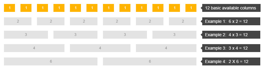
We'll start with setting up the main body of the page in sort of a meta fashion. Bootstrap uses grids to set layout on a page. See the w3schools page for a quick ref! Think of this page as a bunch of stacked rows with 12 cells (or columns, technically) in each row. Each row can have elements that take up one or more of those 12 cells. Bootstrap is smart in that all you have to do is tell it how many columns of content to display and it'll intelligently figure out how to make the content span across multiple cells to fill up the whole row. You could, however, also specify exacly how many columns a particular element should take... Does that make sense? Pretend you have a table or grid that's invisible and content is place into one or more of the cells on particular rows of the grid.
Heading 1 (<h1>): The main title for the page, usually.
Above is a heading. Remember all the basic display styles are defined by Bootstrap now, but you can override anything with your own styles specified after the Bootstrap includes. That's why they're called "cascading." You can specify a bunch of different ways to display a paragraph, for example. First it grabs the style from linked sheets then it looks for redefinitions or additional specs from the <style> block usually found in the <head> up top, and, finally, it'll look at styles specified inline with HTML elements. Each more specific drilldown overrides any previously defined properties.
Heading 2: Use headings to denote importance and sections
Heading 3: They're hierarchical
Headings are treated very similarly to how they're treated in Google Docs. Like... really, very, exactly similarly... :P
Basic text manipulation
Most text elements can be thought of as existing in their own boxes. It's just that we don't see the boxes since they default to having no borders, etc. Each of the grid cells, using Bootstrap's row and col classes for div tags, I set this document up so that the div elements are to have a background color that's different than the main body of the page.
Within a block of text, if you want to tell the web browser that a specific section of text should be treated differently, like say you want to style it a particular way, you can use the <span> tag and then give that tag an id or a class name and set the style for that element id or class or just style it inline with the style="" attribute.
Tables and links
Ok. This is where it gets complicated quick: TABLES!
| This is a table | Huzzah! |
|---|---|
|
This table is styled completely with Bootstrap. It's super easy with just some class definitions for the whole table! Most of the attributes for the table element have been deprecated with HTML5. In fact, most ways of styling text using HTML have been deprecated in favor of stylesheets, but modern browsers tend to be backwards compatible... |
|
|
Again, there's quite a bit to CSS that you can do, and Bootstrap bundles them up into a common framework, so start looking at examples online for inspiration and then look at their source code or consult a good reference! With CSS, there's so much more flexibility to how things look than with just HTML. (Once we start JavaScript stuff, you'll then start changing how things behave, too.) |
|
Images
Aligning images and other elements... For text in CSS, you could use a style that uses "text-align: center;", but for an image, the best way to do it I found was to set the image as a block and then set margins to the left and right to be automatically adjusted: "display: block; margin-left: auto; margin-right: auto;" The fact that different elements are treated differently is a little confusing, huh? And now with Bootstrap, that code is predefined in classes mx-auto and d-block.

I'm playing around with putting the image to the left or right of text... With CSS, this was done by setting a float position. There's also a way to use an object called a flexbox... It seems like Bootstrap 4 embraces the flexbox thing, so I'm trying it out here... Basically, you declare a new div section as a media class and then put the image and text into different parts of the section.
Here's the grid of images again... they're done using the regular CSS code, actually, but it'd be possible to put them in the flexbox format or to use the grid system in Bootstrap.